About Plantry
Plantry is a personalized grocery list generator and meal planning app designed to simplify food planning for individuals with allergies, sensitivities, and budget constraints. The app creates tailored meal suggestions and automatically generates organized grocery lists, helping users save time, reduce stress, and shop with confidence. Plantry focuses on accessibility and practicality, ensuring that eating well is both safe and affordable.

This project was developed through a comprehensive end-to-end design process. I began by defining the app’s name, motto, brand identity, color palette, and typography system, followed by detailed app descriptions and core functionality planning. I created user personas to better understand the needs of the target audience, then developed a content map, interaction map, and site map to structure the user experience. A mood board; curated through selected fonts, colors, and visual inspiration; established the app’s tone and overall aesthetic direction.

From there, I designed black-and-white wireframes of the login flow, built a pattern library including multiple button states and custom iconography, and developed key interface components. The project culminated in ten fully designed screens that applied the established design system cohesively. Finally, I brought the complete interactive prototype to life in Adobe XD, resulting in a thoughtful, user-centered application grounded in both strategy and visual design.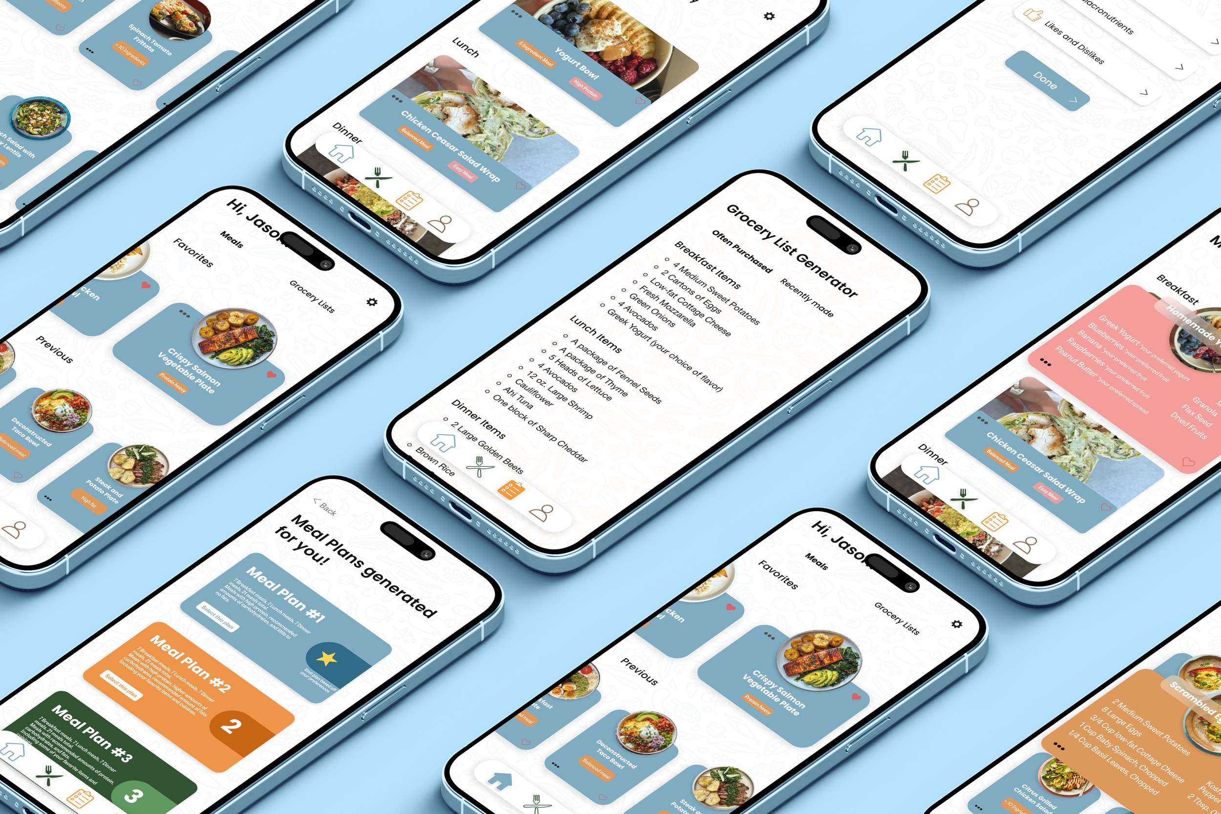
Using Plantry
Step inside Plantry with the video below to see how thoughtful design transforms meal planning into a safe, simple, and budget-friendly experience. This user pov video offers insight on how Plantry creates a seamless, and easily navigable meal planning and grocery list generating app.
The process
Plantry was created with intention at every step, starting with a clear mission to make meal planning safer, simpler, and more affordable for people with dietary restrictions and budget concerns. I approached the project holistically, building the brand identity, defining the user experience strategy, and mapping out every interaction before moving into visual design. Through research-driven personas, structured content planning, wireframing, and a cohesive design system, I developed a fully realized, user-centered app prototype that balances functionality with thoughtful, accessible design.
The images below depict this exact process, going through each step of the app creation process. Starting with the initial app name and description to lastly, ten finished design screens that acted as inspiration for the final product.
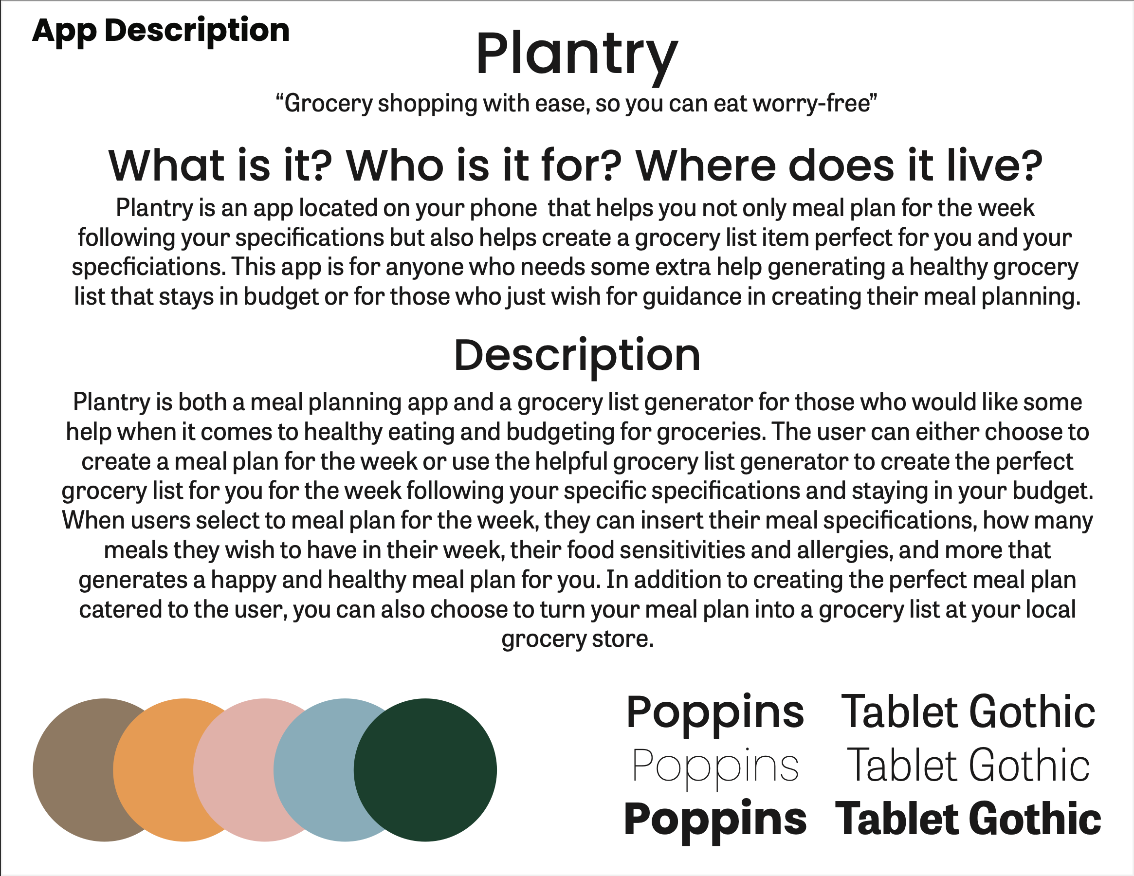
This page introduces Plantry’s name, motto, typography, and core concept, establishing the app’s mission and defining who it serves. It lays the foundation for the brand identity, color scheme, and overall purpose of the application.
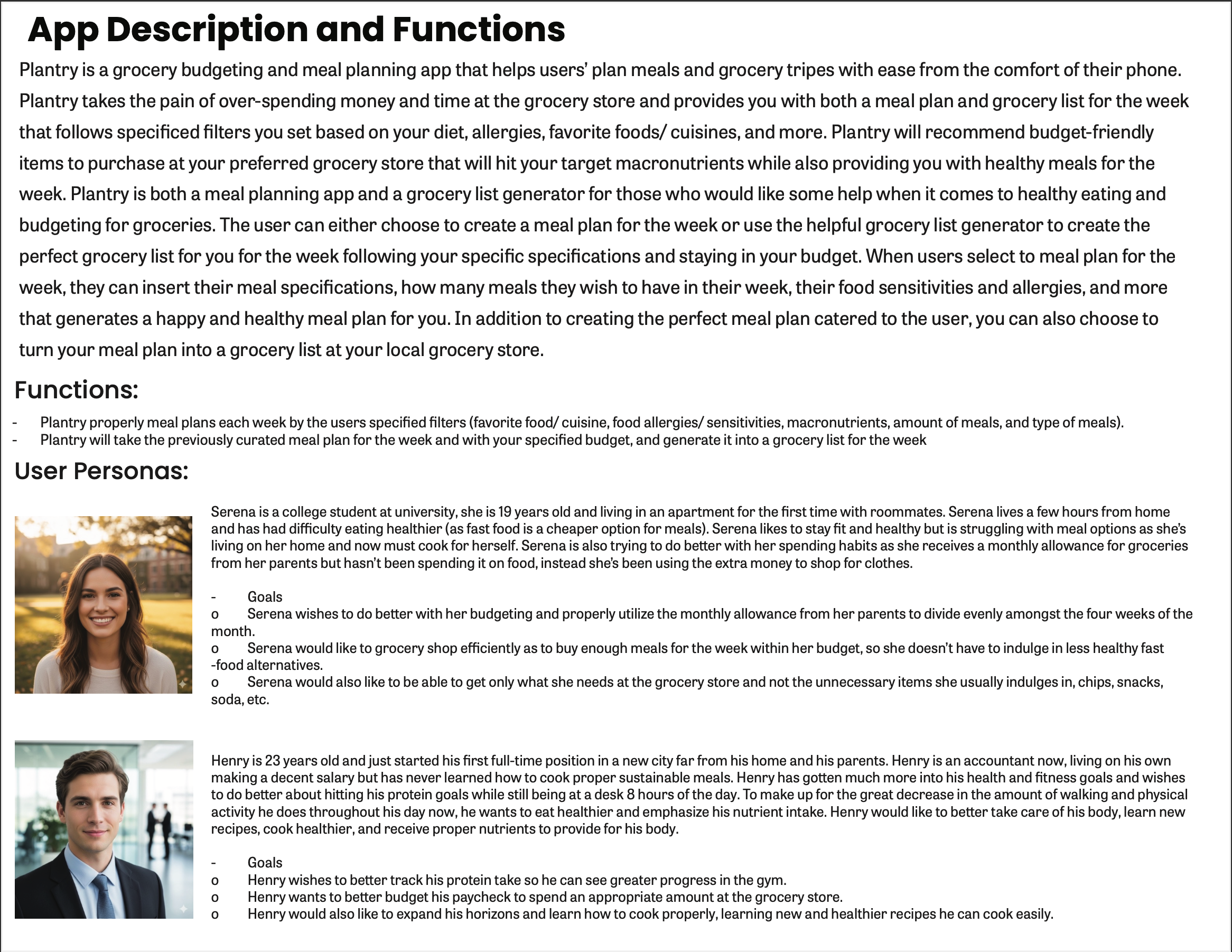
This section outlines Plantry’s key features and functionality while introducing detailed user personas to ground the app in real user needs. It defines the problems the app solves and the goals it aims to support.
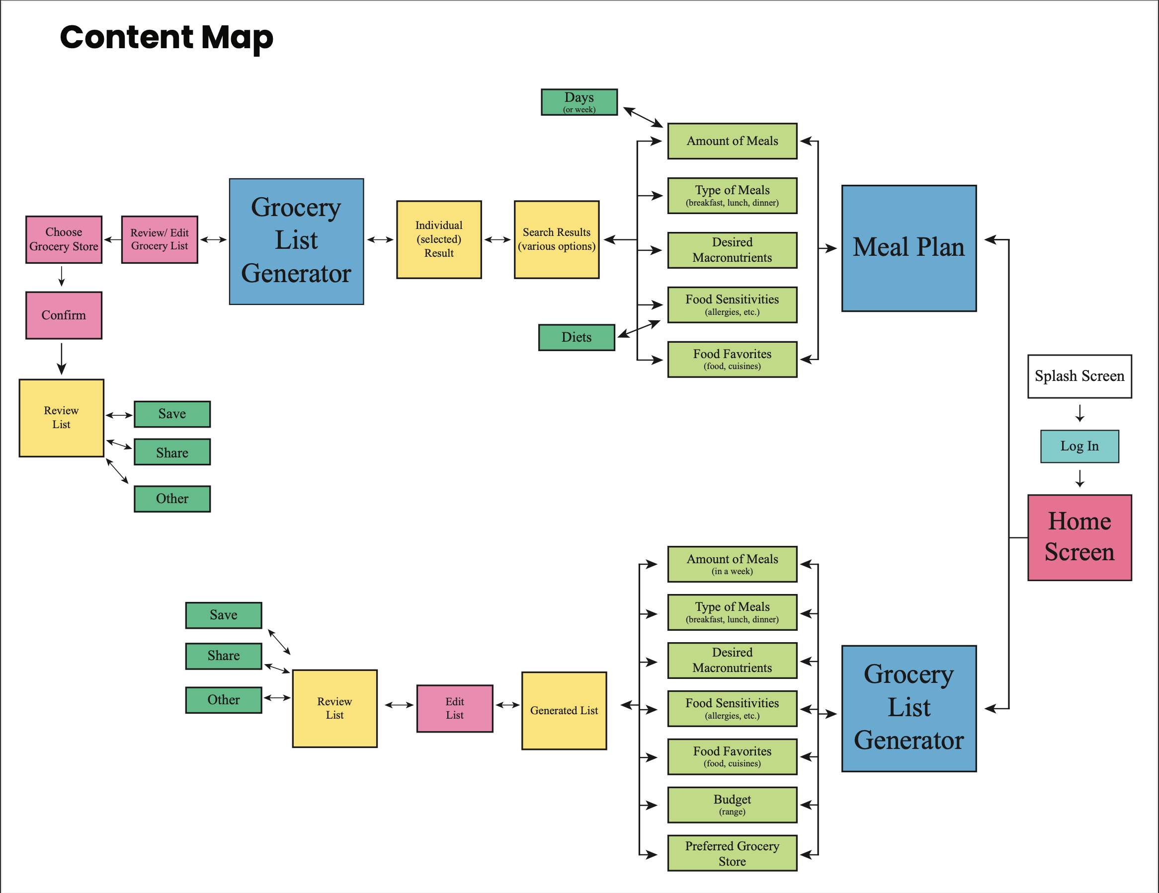
The content map organizes the app’s primary features and information architecture, showing how meal planning and grocery list generation connect. This step ensured logical structure before moving into interface design.
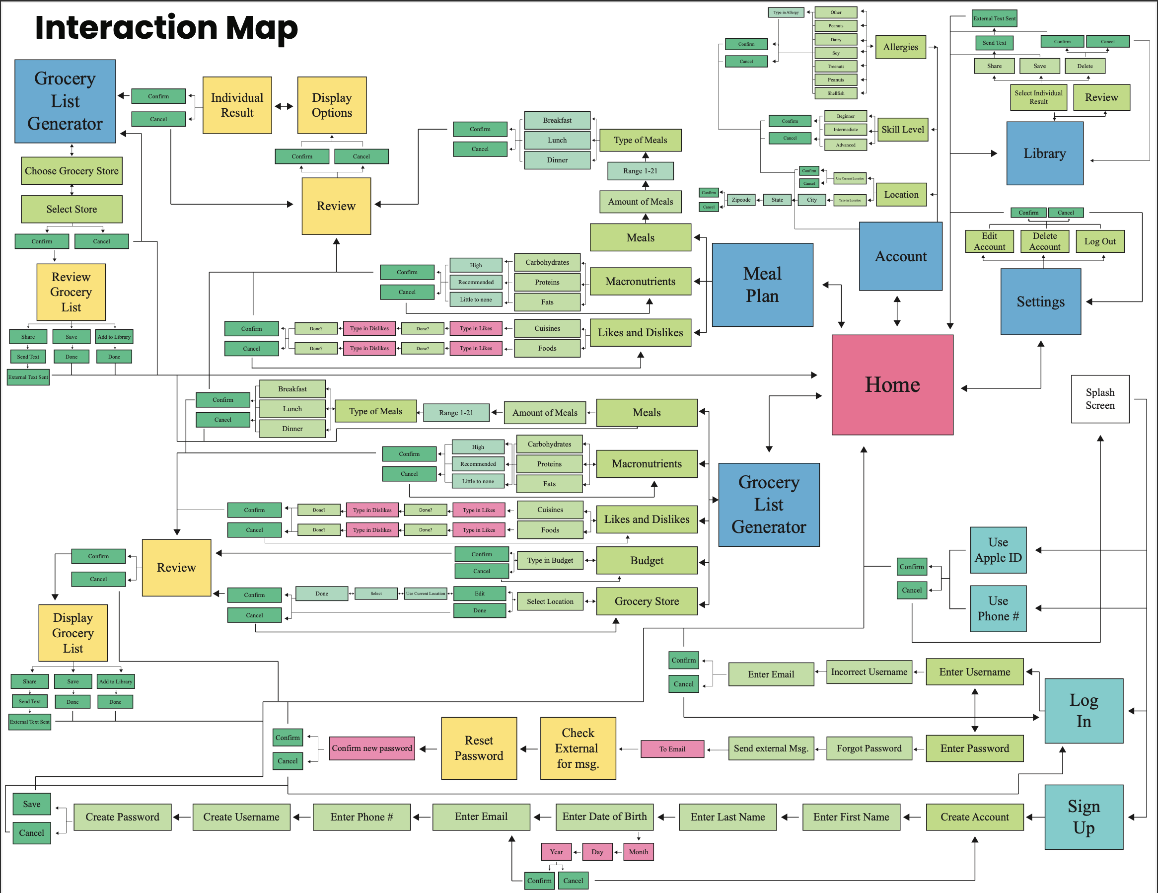
The interaction map visualizes how users move through the app, mapping out decision points, confirmations, and navigation paths. It focuses on creating a seamless and intuitive user experience.
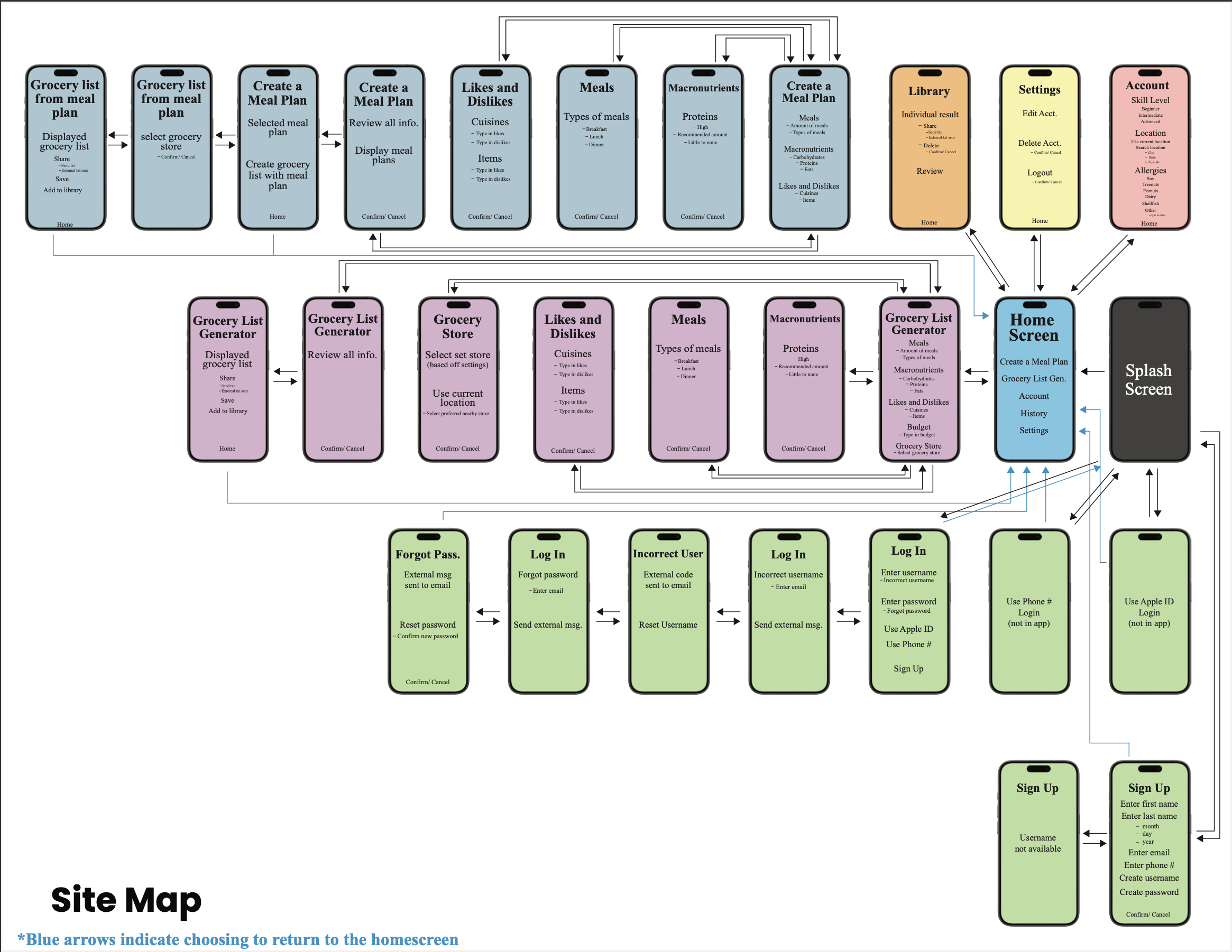
The site map outlines the full structural hierarchy of the app, clarifying screen relationships and navigation flow. This step solidified the app’s framework before detailed design began.
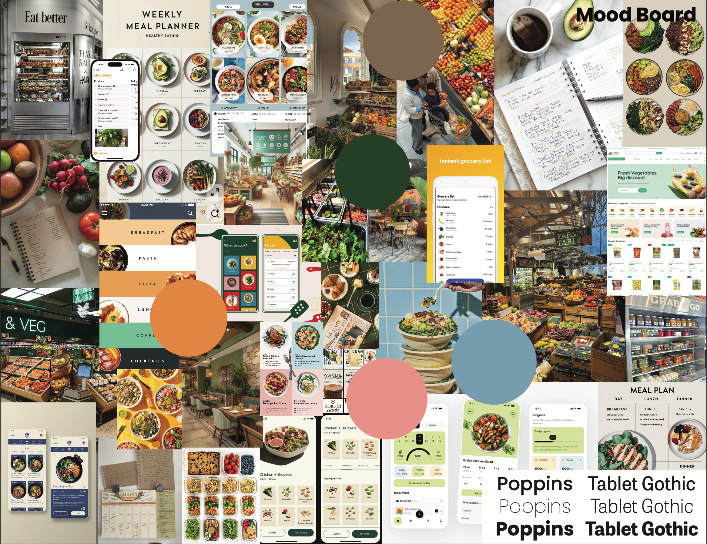
The mood board establishes Plantry’s visual direction through curated imagery, color inspiration, and typography choices. It defines the tone as fresh, approachable, and practical.
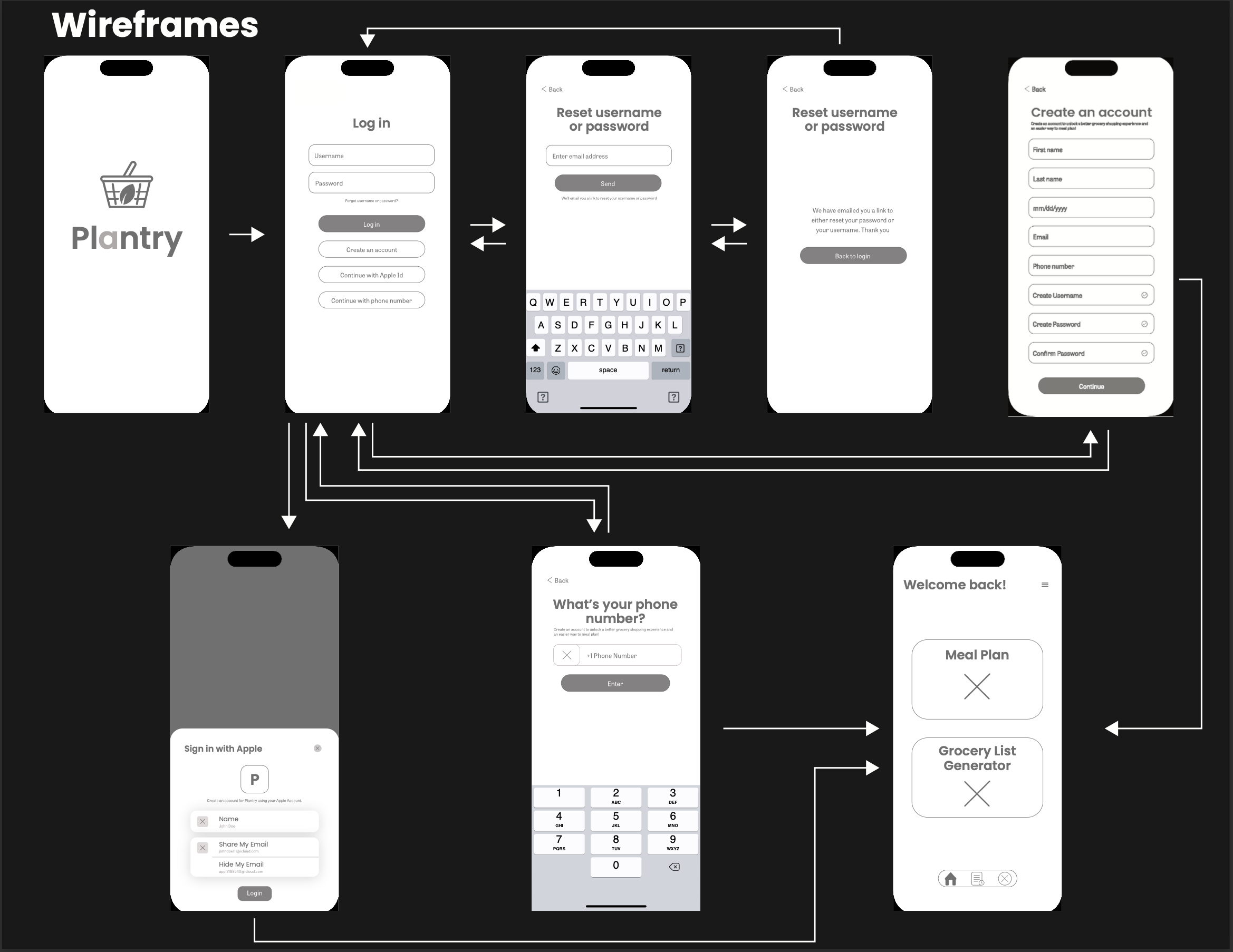
These simple wireframes without color focus on layout, usability, and flow without visual distractions, specifically that of the app's login process.
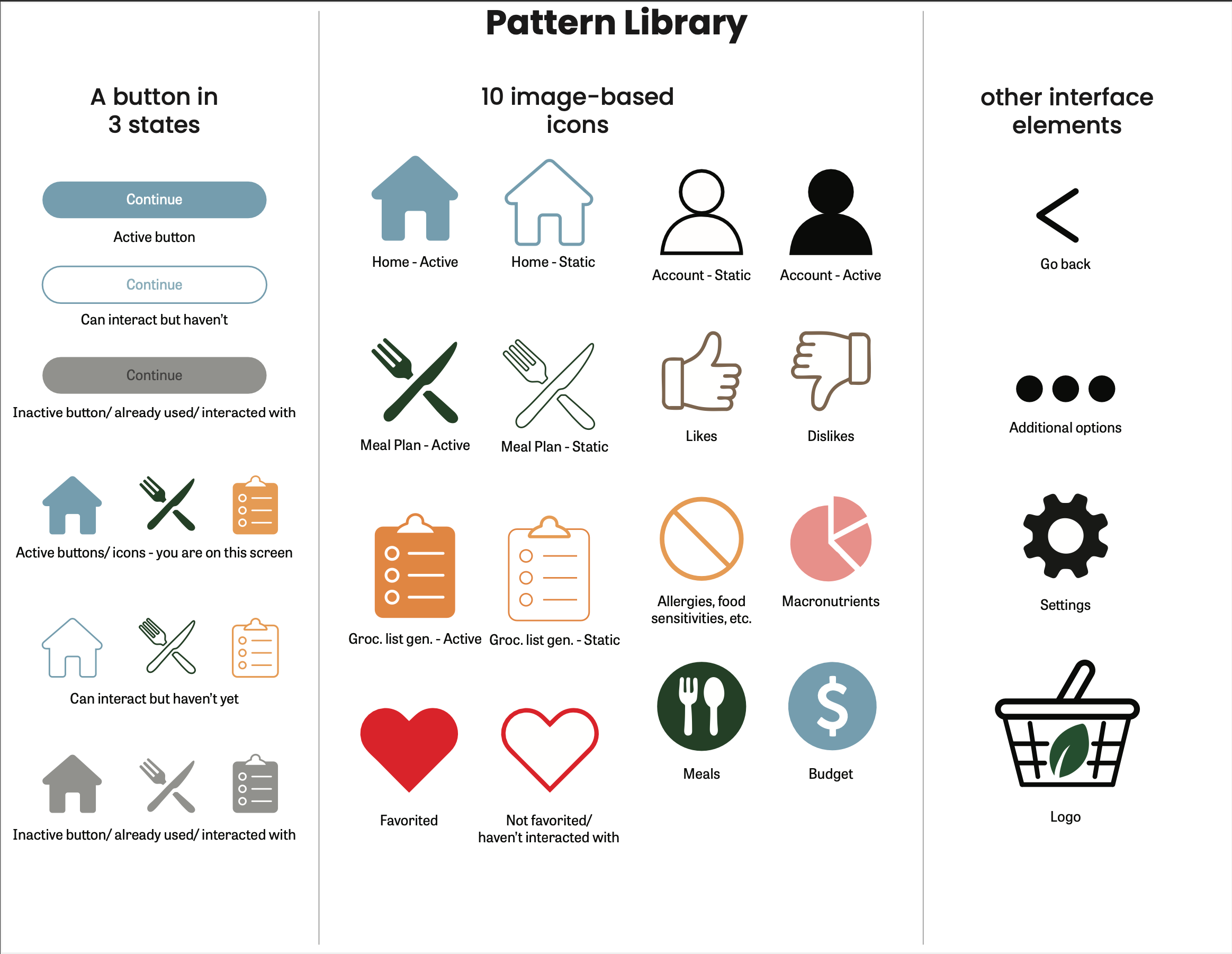
The pattern library defines reusable components, button states, icons, and interface elements to ensure visual consistency. This system supports scalability and cohesive designs to be used across all screens of the app.
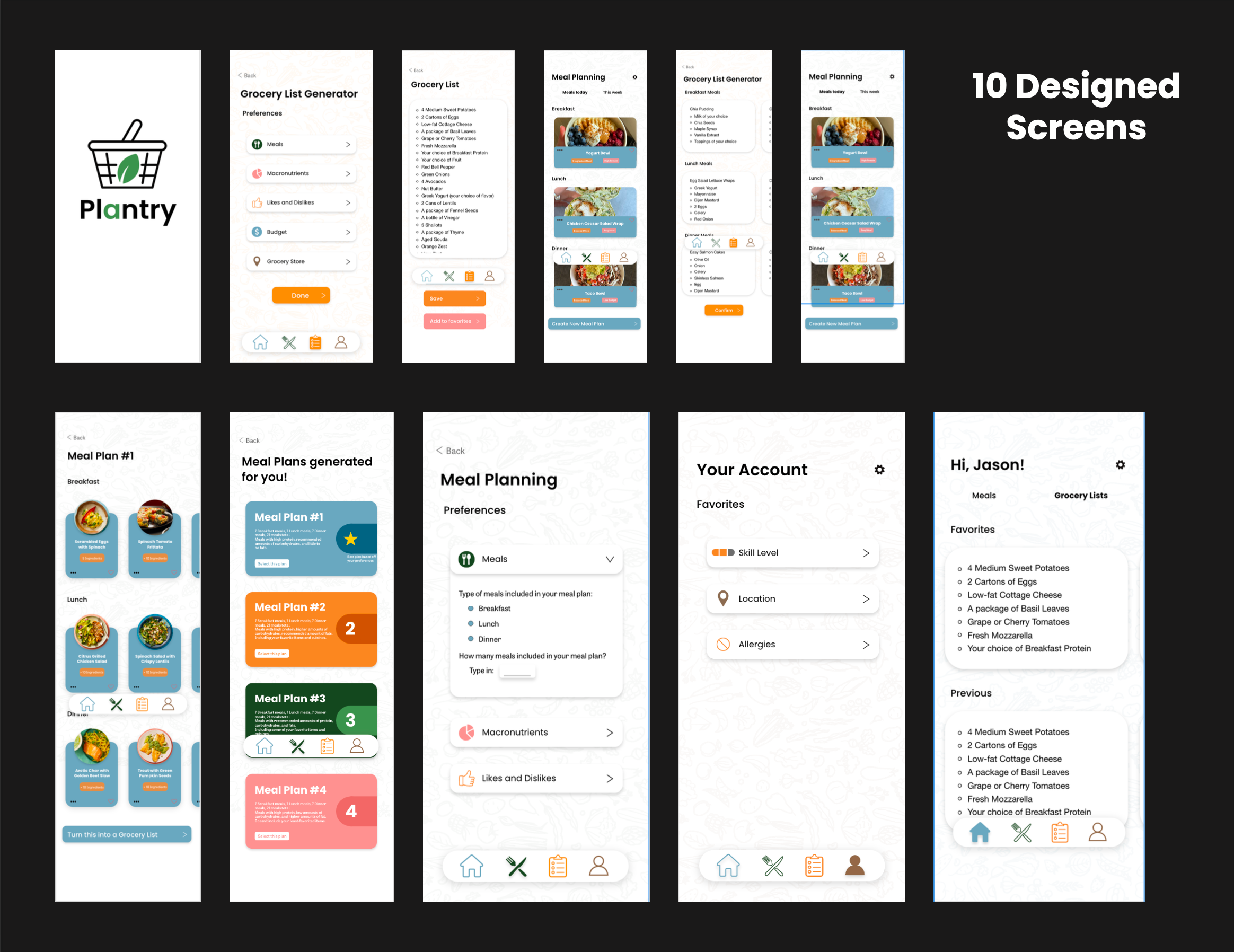
The final screens apply the complete design system, showcasing ten designed, polished interfaces and cohesive screens throughout the app. This stage represents the culmination of strategy, structure, and visual style before the execution of the final product.