SC Works Website Rebrand
This project showcases my design work on a proposed rebrand of the SC Works website (scworks.org), a statewide workforce platform that connects jobseekers and employers across South Carolina. SC Works serves as a central hub where individuals can search for jobs, connect with employers, locate SC Works centers, access the Virtual Engagement Center, explore workforce resources, and view hiring events through the calendar system.

After evaluating the existing website, I identified opportunities to enhance visual engagement, modernize the layout, and create a more user-centered digital experience. While the current site is functional and straightforward, the goal of this rebrand was to introduce a refreshed aesthetic that would increase user retention, improve navigation clarity, and create a stronger emotional connection with visitors; without losing brand recognition.

In collaboration with fellow graphic designers and Design Manager, Sinise Beckett, at the Department of Employment and Workforce, we developed an updated color palette and explored multiple homepage and interior page concepts. Each designer curated unique layout solutions, allowing us to compare and contrast successful elements across designs.

My contributions included redesigned homepage concepts, a newly structured calendar of events page, a regional “Find a Center” page featuring an interactive state-region approach, and a refreshed jobseeker landing page focused on clearer pathways to employment resources. Throughout the redesign process, I intentionally retained recognizable brand elements;  including existing textures, buttons, icons, and foundational colors;  to maintain brand consistency while introducing elevated typography, stronger imagery, improved spacing, and more dynamic visual hierarchy.

The result is a series of modernized, visually engaging page concepts that balance familiarity with innovation. By enhancing layout structure, color usage, and user flow, these designs aim to create a more intuitive and compelling digital experience;  encouraging users to stay on the site longer, explore available resources, and more easily connect with employment opportunities and workforce services.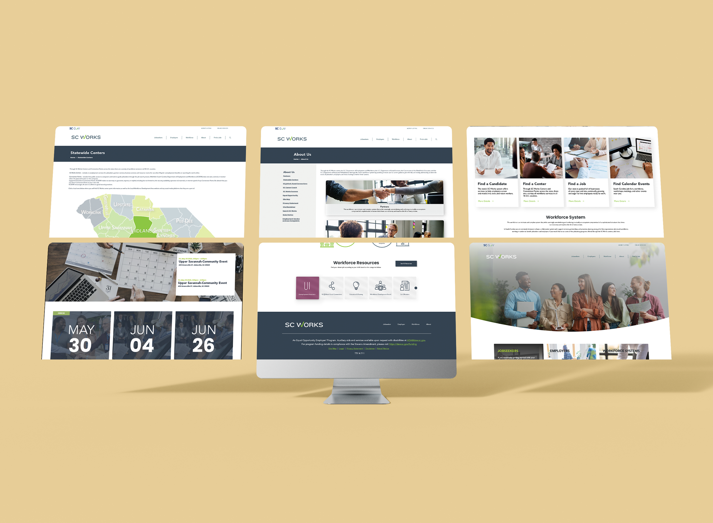
Before…
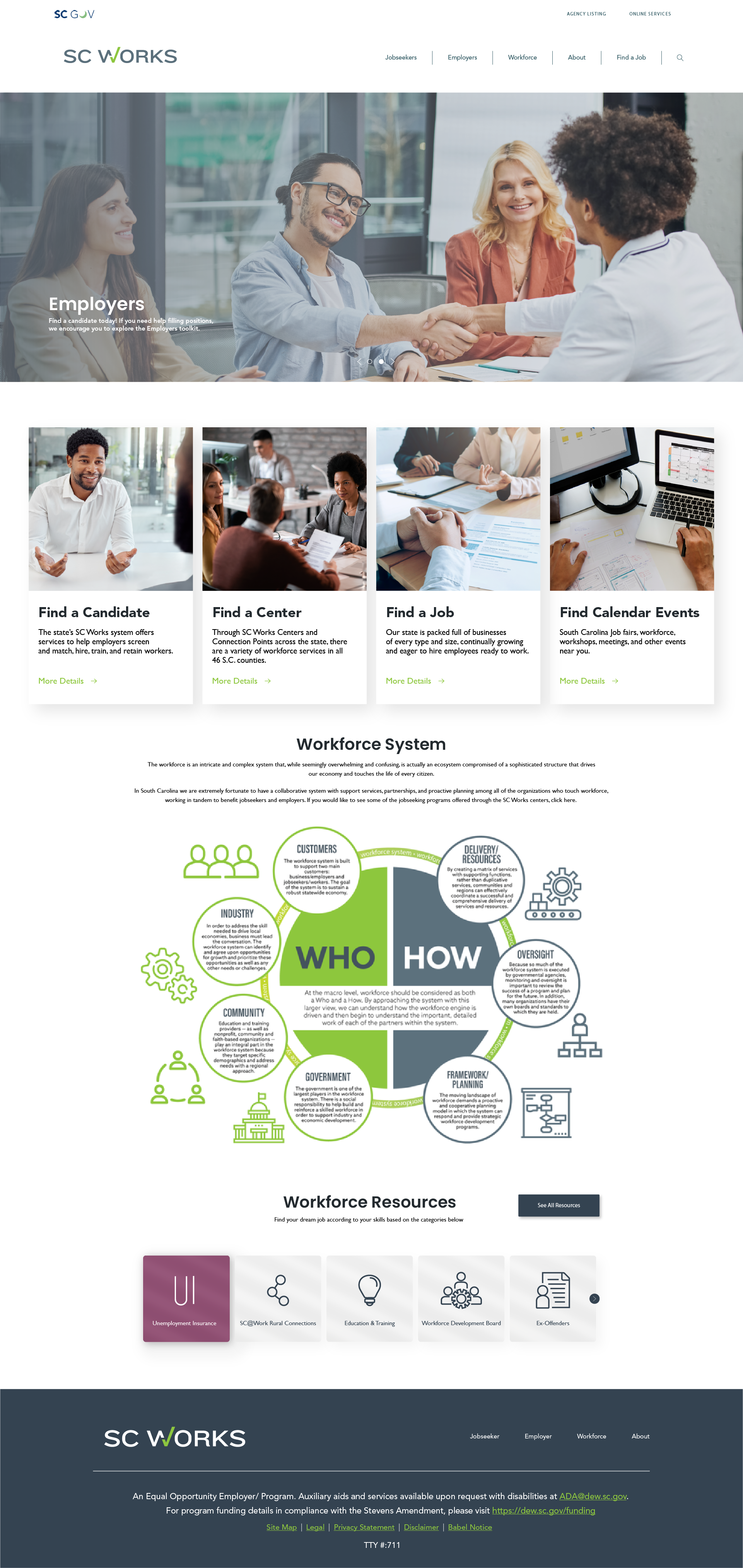
The images below depicts the website prior to the redesign. The website offers clear insights and intuitive navigation, but its static layout and lack of visual dynamism limited user engagement. The redesign was driven by the need to create a more compelling, modern experience that better captures attention and reflects the brand’s energy.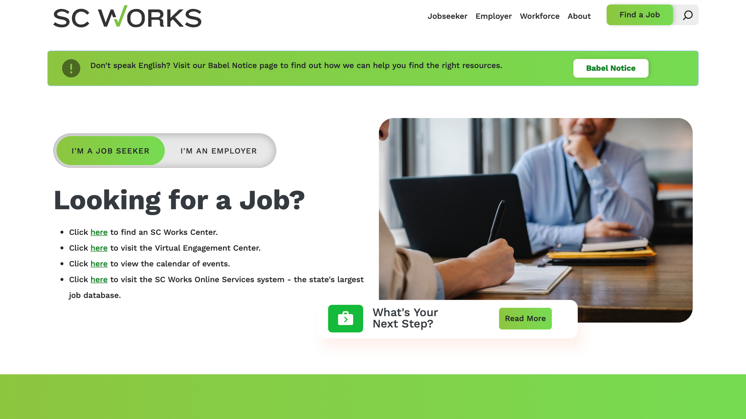
After…
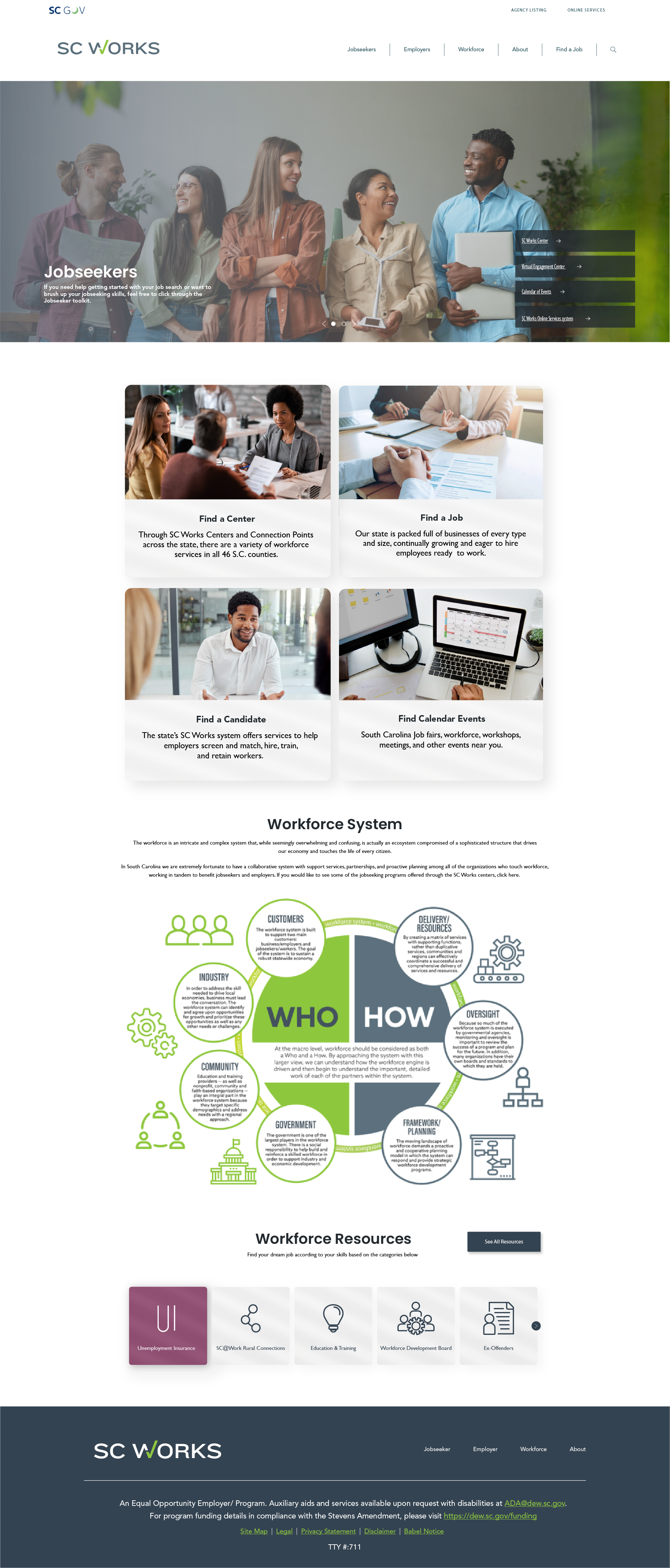
The images below depicts a redesigned layout of the website introducing a more polished and dynamic visual identity. The redesign offers layered imagery, bold overlays, and a refined color palette that elevates the overall experience. Throughout the process, several iterations of screens/ pages were created, making for various engaging designs to choose from. These enhancements create a more immersive and engaging journey, encouraging users to explore deeper and interact with the site more meaningfully.
This redesigned SC Works homepage serves as a clear, welcoming entry point for jobseekers, employers, and workforce partners. The layout emphasizes intuitive navigation, quick access to key services, and a strong visual hierarchy to guide users toward finding jobs, hiring talent, or exploring statewide workforce resources. This screen displays only one of the three designed home pages.
This redesigned SC Works homepage serves as a clear, welcoming entry point for jobseekers, employers, and workforce partners. The layout emphasizes intuitive navigation, quick access to key services, and a strong visual hierarchy to guide users toward finding jobs, hiring talent, or exploring statewide workforce resources. This screen displays the second of the three designed home pages.
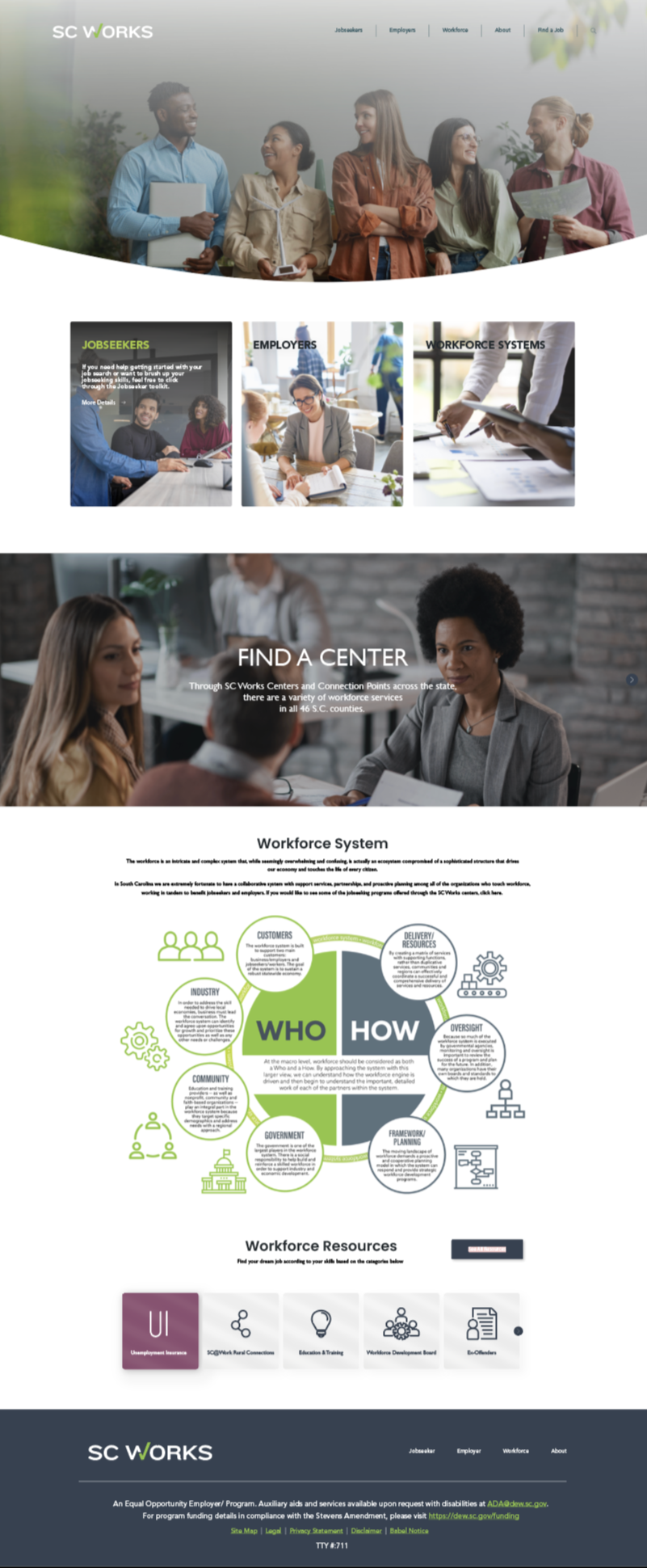
This redesigned SC Works homepage serves as a clear, welcoming entry point for jobseekers, employers, and workforce partners. The layout emphasizes intuitive navigation, quick access to key services, and a strong visual hierarchy to guide users toward finding jobs, hiring talent, or exploring statewide workforce resources. This screen displays the third and final designed home pages of the three crafted.
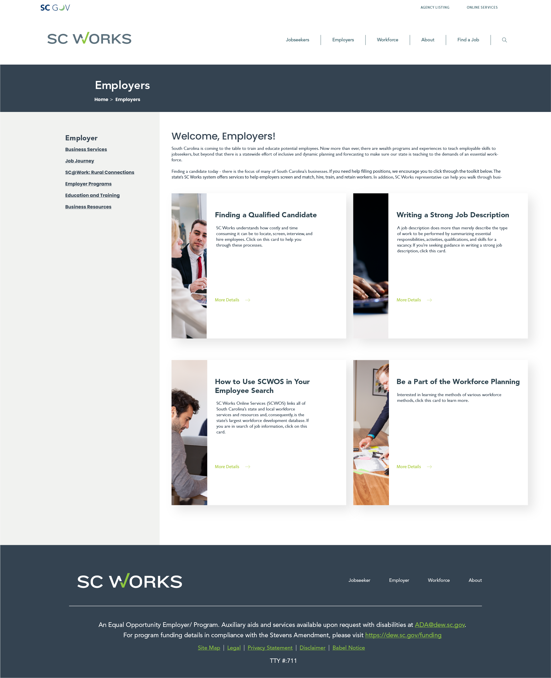
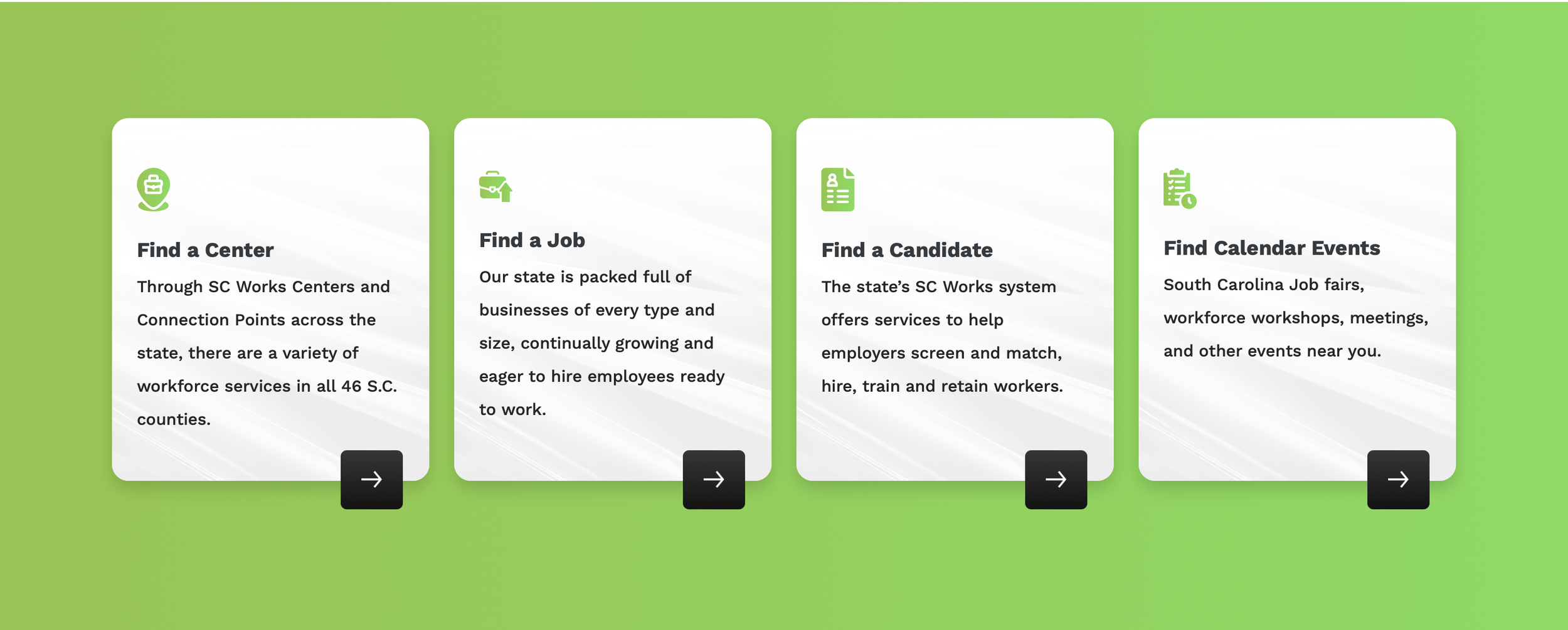
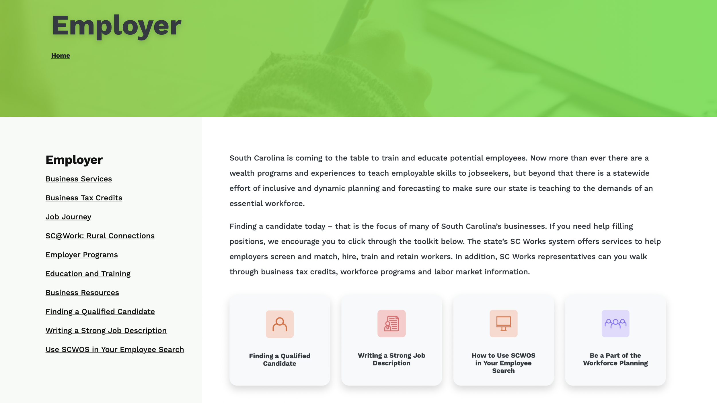
This redesigned Employers page provides a centralized hub for businesses to access hiring tools, workforce programs, and guidance on recruiting and retaining talent. The layout organizes key resources into clear, actionable sections, making it easy for employers to navigate services and connect with SC Works support.
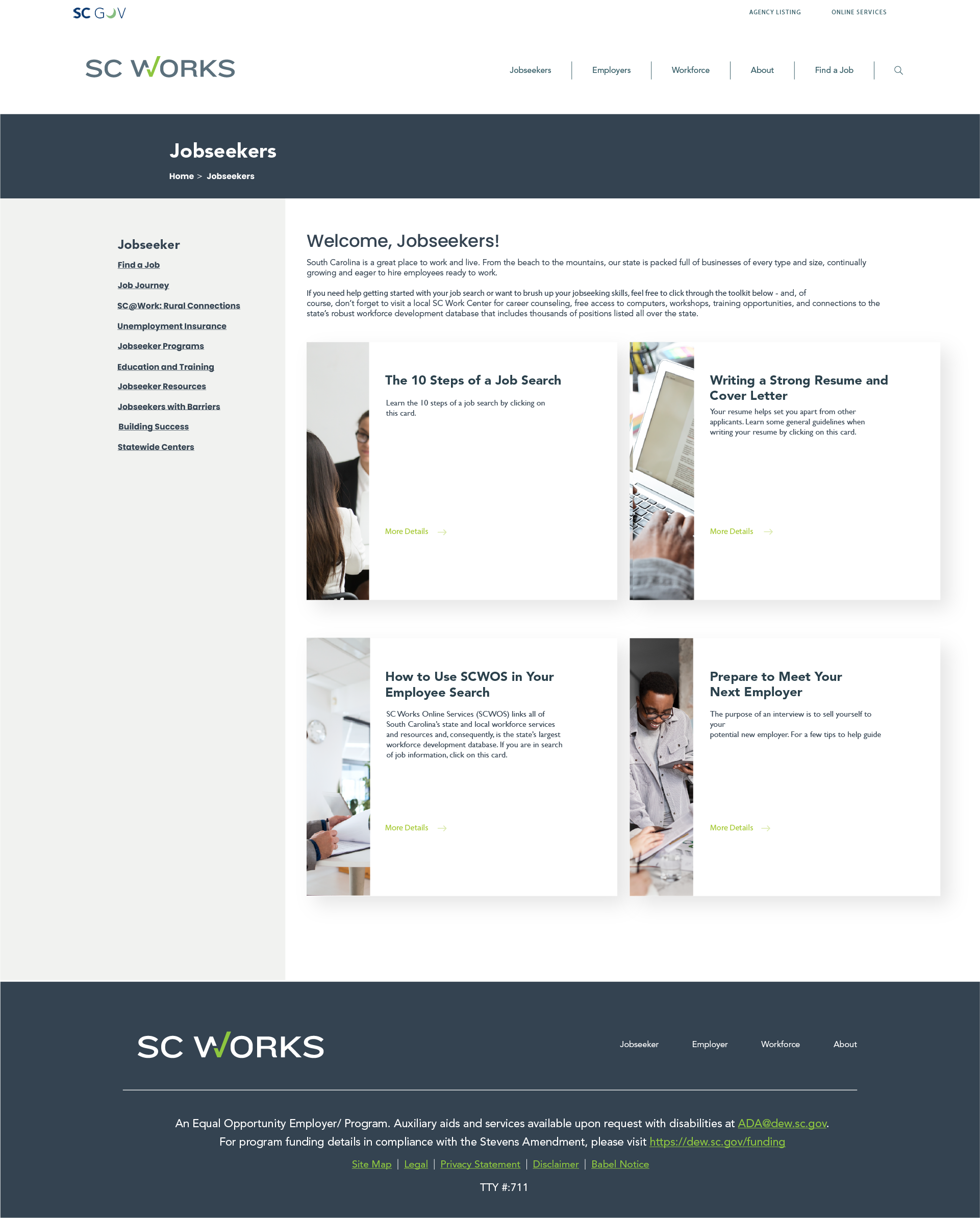
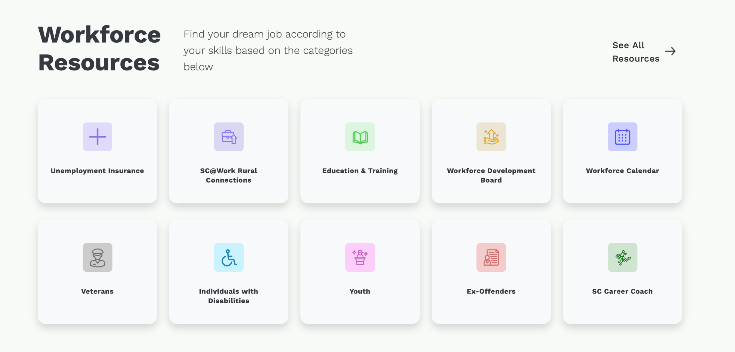
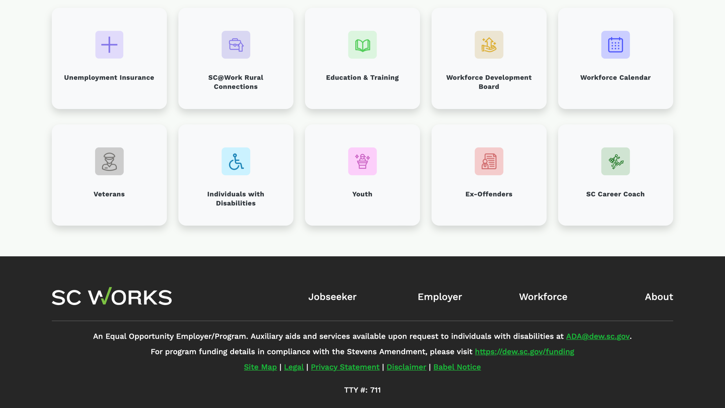
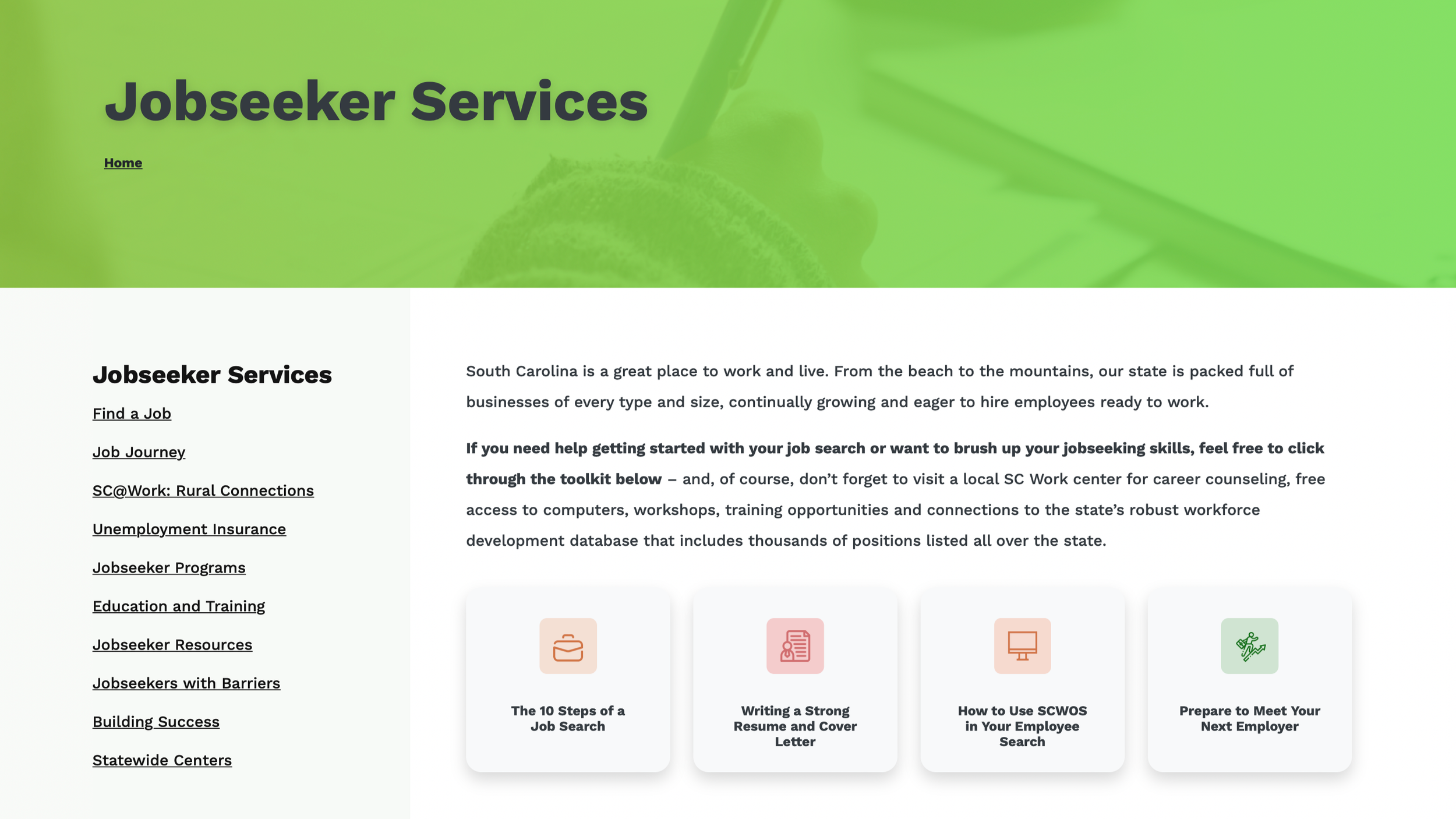
This redesigned Jobseekers page serves as a comprehensive resource hub, guiding users through every stage of the job search process. The layout highlights essential tools, career guidance, and workforce programs in a clear, structured format to help individuals confidently navigate their path to employment.
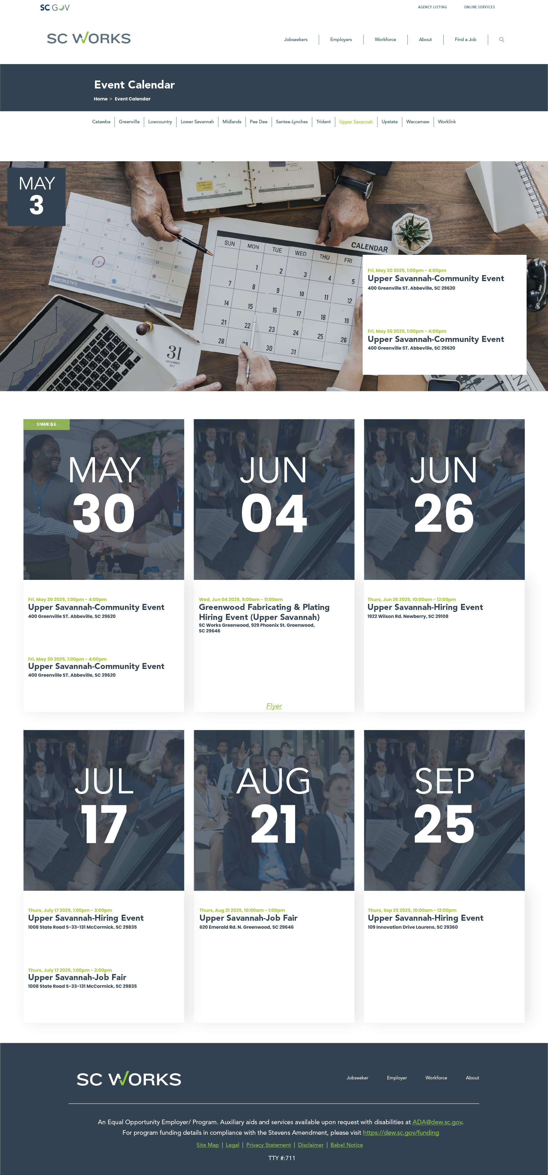
This screen highlights the redesigned SC Works Event Calendar, created to provide jobseekers and employers with a clear, organized view of upcoming hiring events, job fairs, and community programs. The layout prioritizes accessibility and scannability, making it easy to browse dates, locations, and event details at a glance.
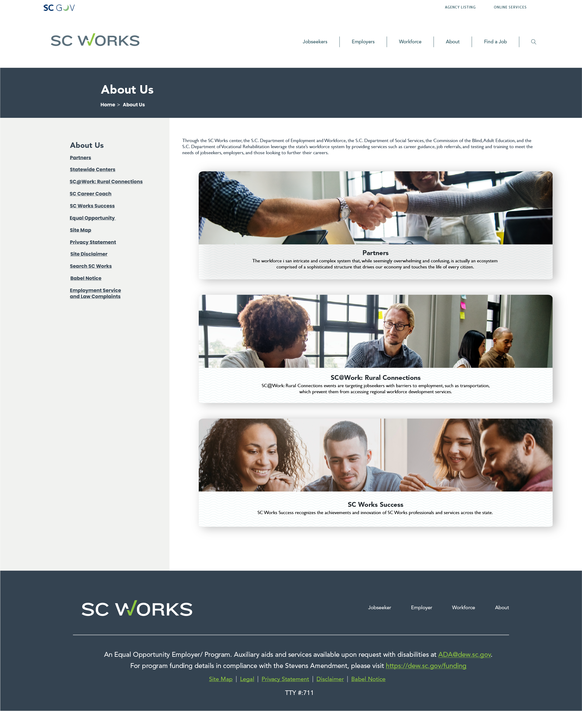
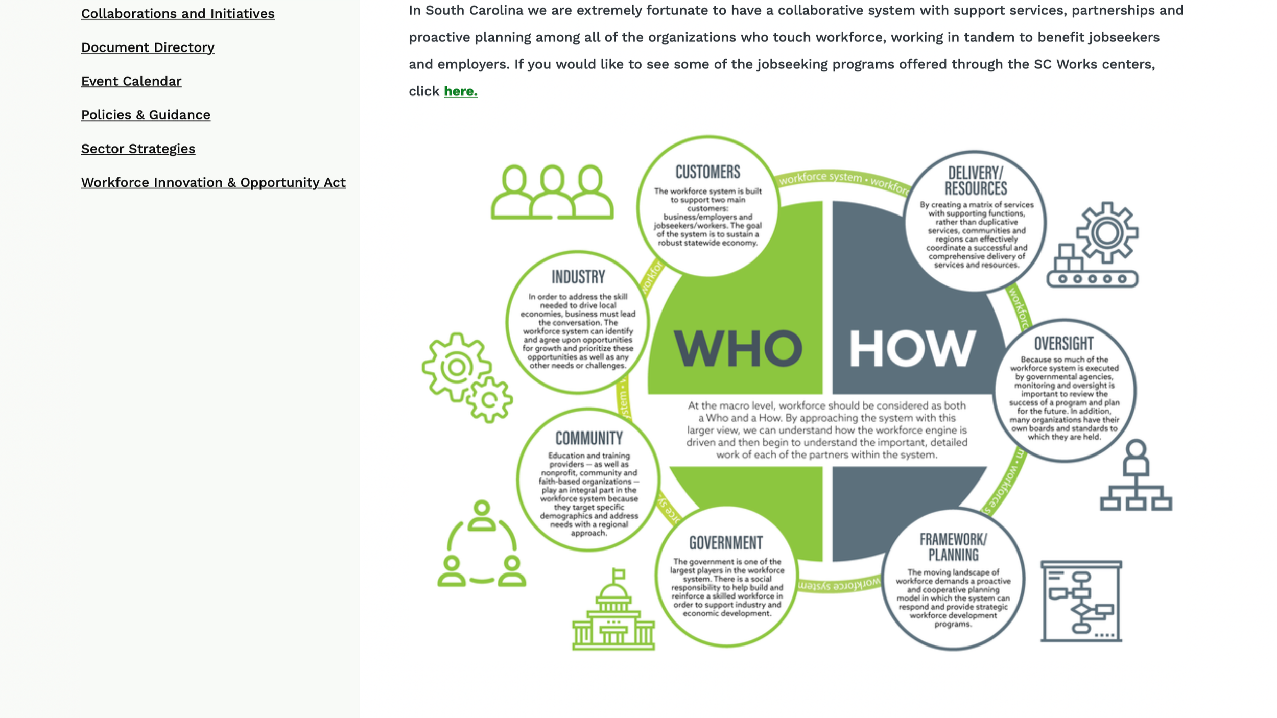
This redesigned About Us page provides a clear overview of SC Works’ mission, partnerships, and statewide impact. The layout organizes key initiatives and resources into structured, visually engaging sections that help users better understand the organization’s role in supporting South Carolina’s workforce.
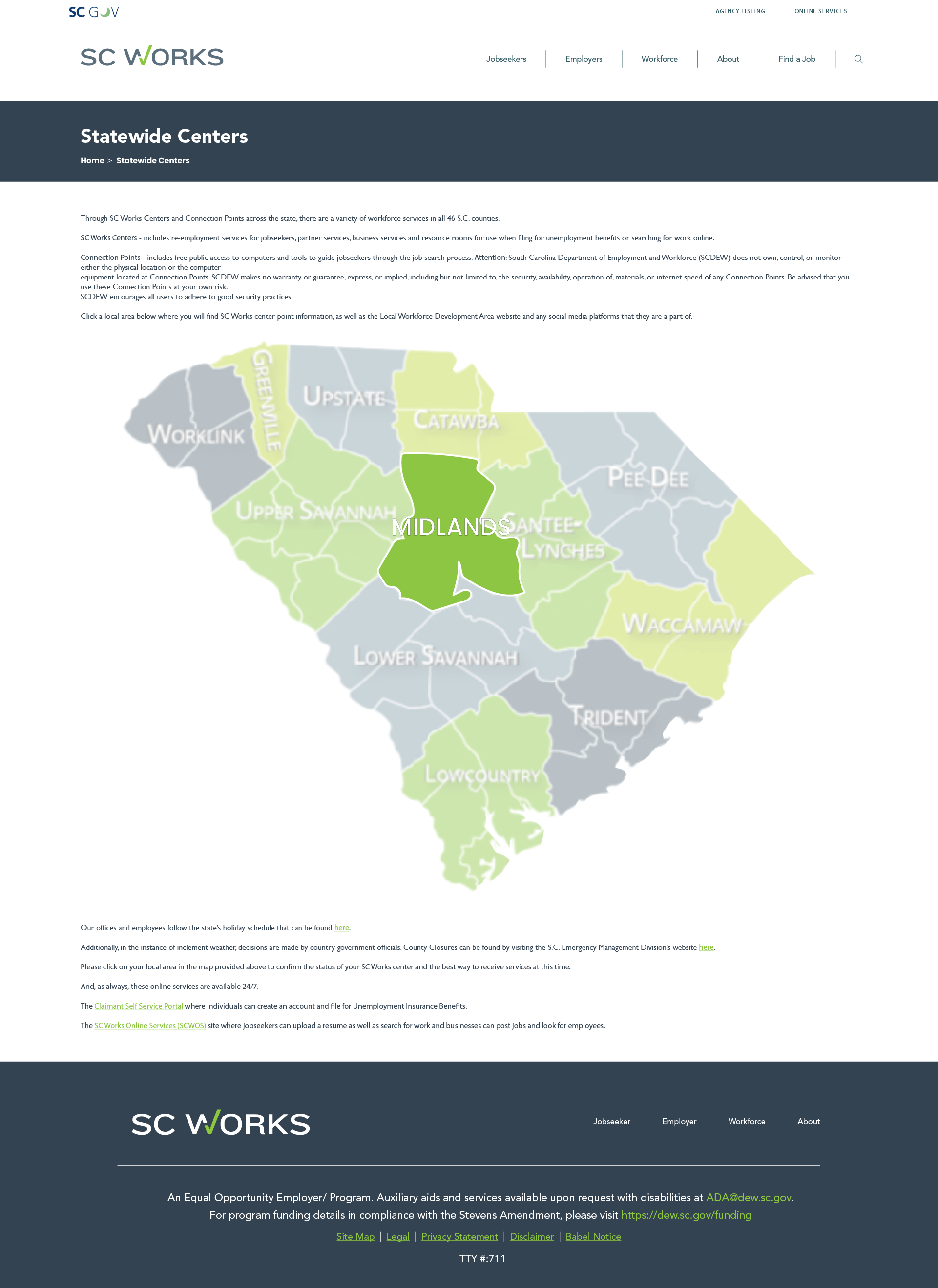
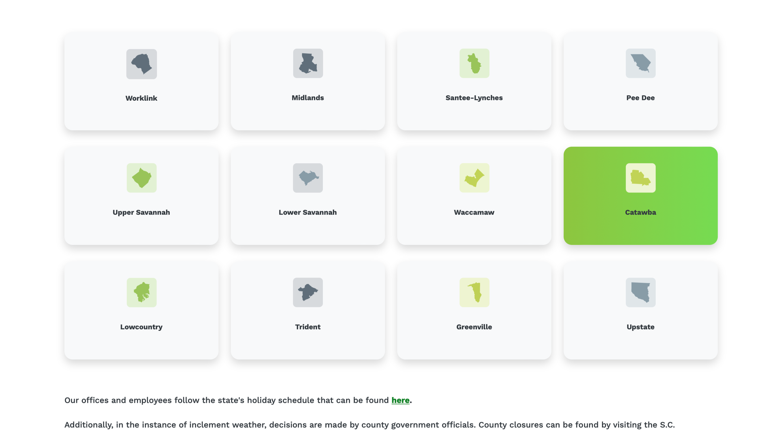
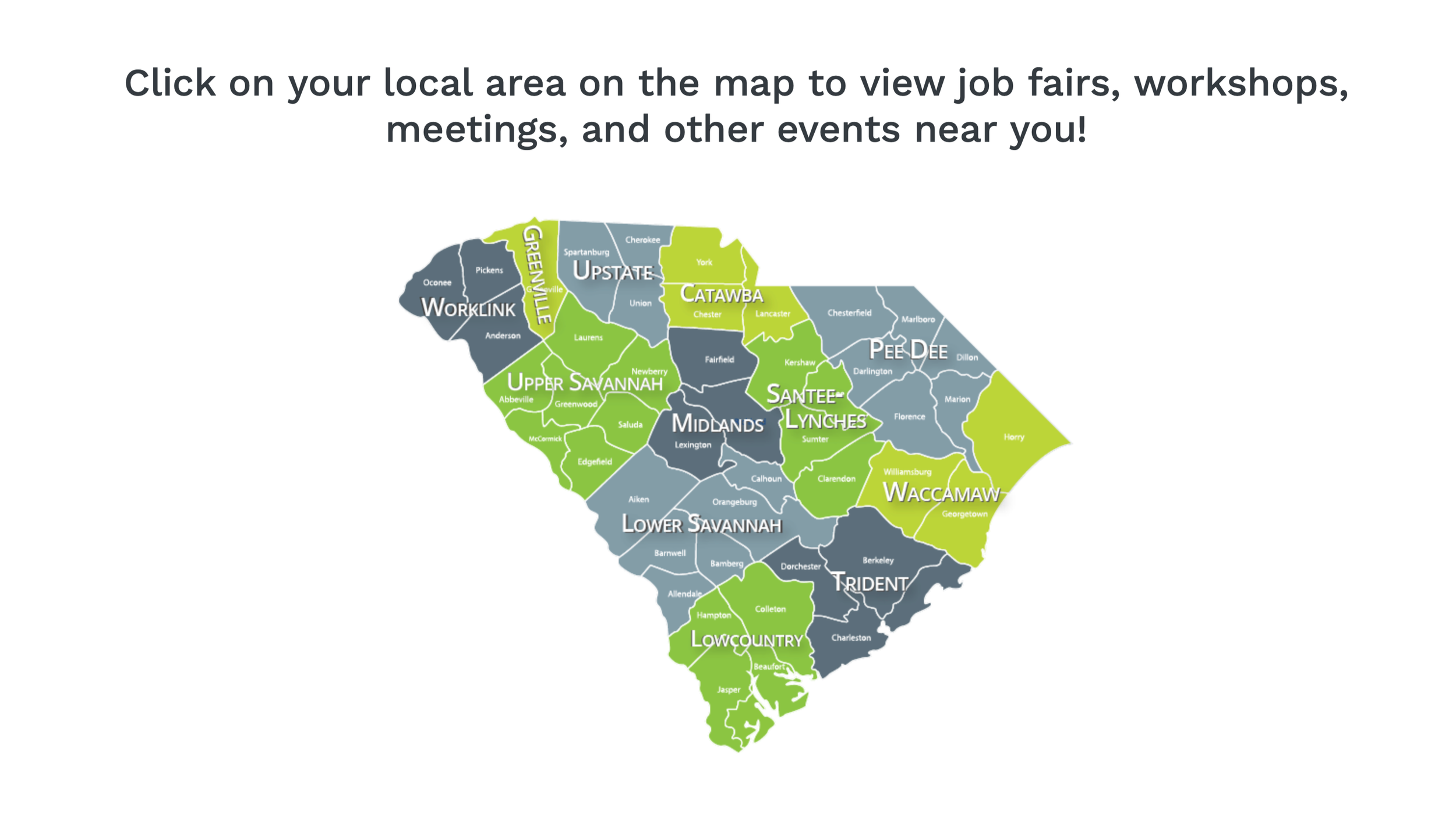
This redesigned Statewide Centers page features an interactive regional map that allows users to select their area and quickly access relevant SC Works centers, resources, and workforce information. The layout simplifies navigation by visually organizing services by region, making it easier for users to find localized support and contact details.