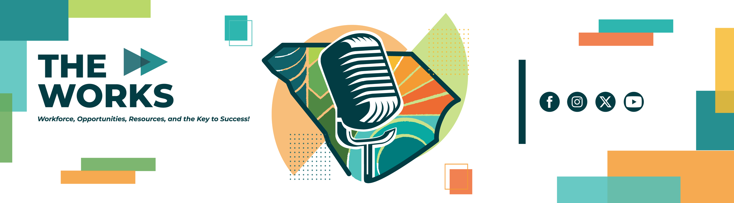
The Works Podcast Logo
The Works is the official podcast of SC Works, created in collaboration with host William Floyd, Executive Director of the S.C. Department of Employment and Workforce (DEW) and Chair of the Coordinating Council for Workforce Development (CCWD). Designed to support short, impactful conversations with workforce leaders, industry experts, CCWD partners, and public officials, the podcast serves as a platform to strengthen South Carolina’s economy and labor force.

This logo design began with research into the podcast’s mission and audience, followed by concept sketches inspired by podcast branding trends, microphone iconography, and South Carolina–specific imagery. Through close collaboration with Graphic Designer Manager; Sinise Beckett, the final concept evolved to feature the silhouette of South Carolina, divided into color-blocked regions representing the diverse communities and workforce across the state. A central microphone anchors the design, symbolizing conversation, connection, and leadership.

Developed in Adobe Illustrator through multiple layout explorations and rounds of constructive feedback, the final mark balances clarity, symbolism, and brand impact. The podcast title, The Works, is paired with the WORKS acronym; Workforce, Opportunities, Resources, and the Key to Success, reinforcing the initiative’s mission.

Beyond the primary logo, the branding system expanded to include logo walls, email banners, and a large-scale wall decal used as a backdrop for podcast recordings. The mark will also be adapted into wearable badges for the host and guest speakers, creating a cohesive and recognizable visual identity across digital and physical platforms.
The final design for The Works podcast logo was created in Adobe Illustrator using masks, layered overlays, and intentional color blocking to shape the South Carolina silhouette and central microphone. Careful typography and a balanced color palette bring clarity, cohesion, and strong brand presence to the final mark.
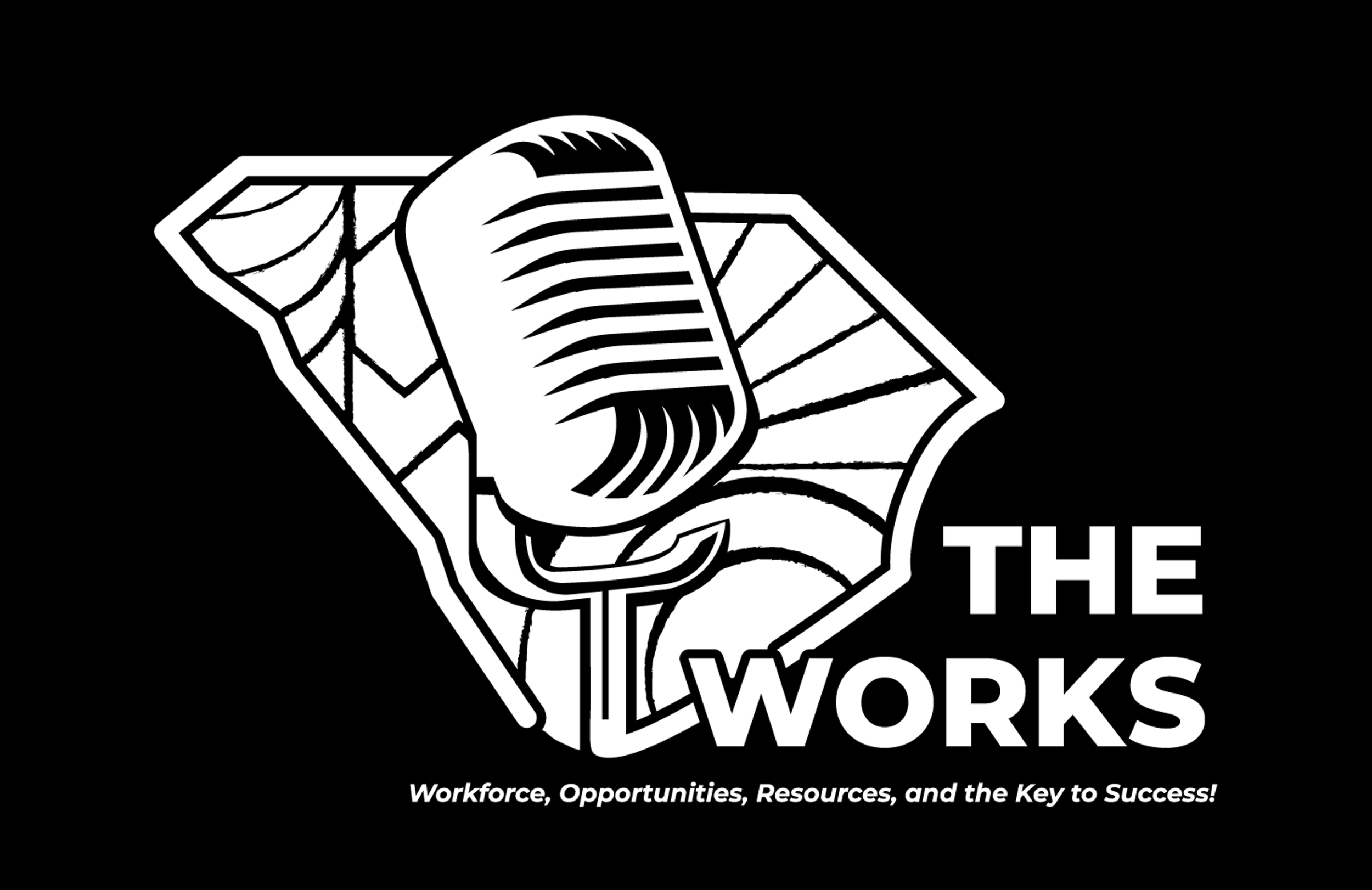
The black-and-white version of The Works logo was refined in Adobe Illustrator using masks and layered vector shapes to maintain clarity and impact without color. Thoughtful typography and strong contrast ensure the mark remains bold, versatile, and recognizable across all applications.
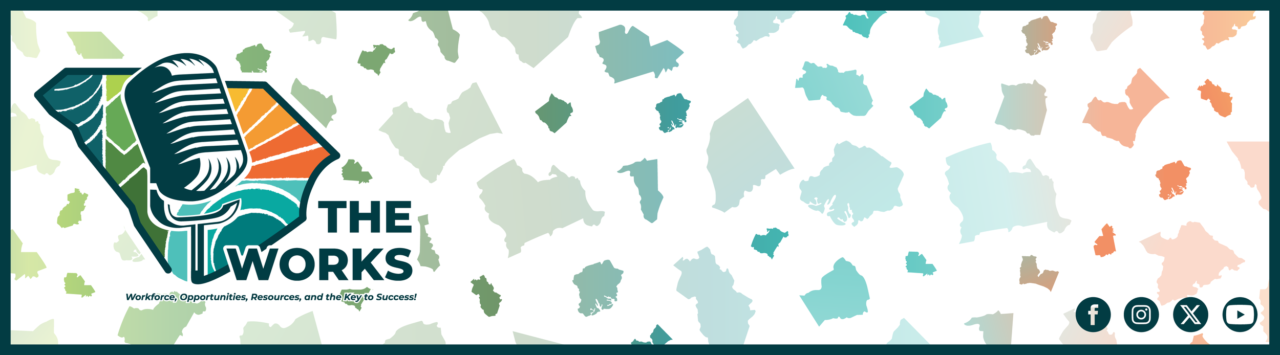
This banner wall extends The Works brand by featuring the podcast logo alongside a patterned backdrop of South Carolina regional icons in the selected brand color palette. Created in Adobe Illustrator using color masks and layered vector shapes, the design reinforces statewide connection while maintaining a cohesive, recognizable visual identity.
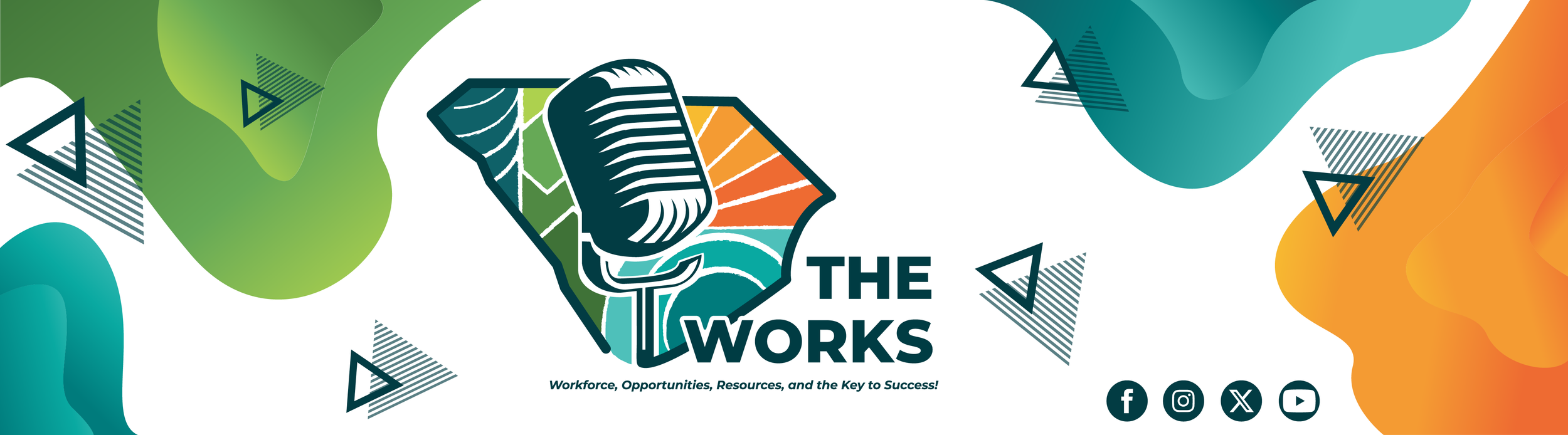
This banner wall variation pairs The Works podcast logo with bold, organic shapes and playful geometric accents to create a more energetic, contemporary feel. Designed in Adobe Illustrator, the layered forms and brand-aligned color palette add visual movement while maintaining a cohesive and recognizable identity.
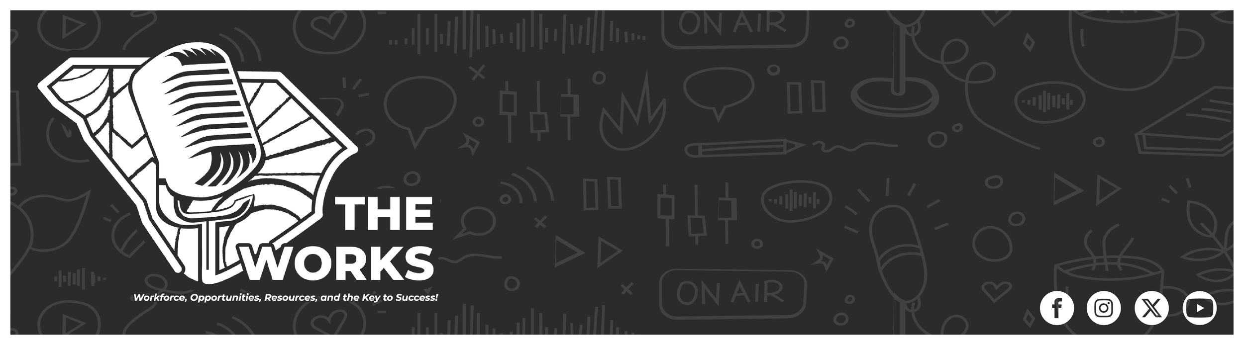
This black-and-white banner variation features The Works logo set against a patterned backdrop of podcast-inspired iconography, creating a bold, high-contrast look. Designed in Adobe Illustrator, the monochromatic palette enhances versatility while the subtle background graphics reinforce the podcast’s theme and energy.
This banner variation separates the logo mark from the typography, allowing each element to stand independently while maintaining a cohesive layout. Designed in Adobe Illustrator, the lively geometric shapes and layered color accents add energy and movement while reinforcing the podcast’s bold, modern identity.
The Process…
These logos below represent the first rough draft concepts for The Works and gradual design process of the podcast logo, where I began translating my initial ideas into visual form through sketches in Adobe Illustrator. At this stage, I focused on putting my thoughts down quickly and exploring a range of directions inspired by popular podcast iconography, such as microphones, gears (as symbolism for The Works), and broadcast symbols. These early explorations allowed me to experiment with layout, typography, and symbolism while refining how the visual identity could reflect the mission and impact of The Works before evolving into the final mark.
The Works Logo Development
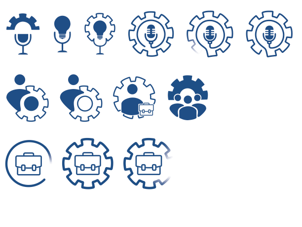
These initial logo concepts were quick, rough drafts created to get my ideas out visually before refining the brand. At this stage, the designs intentionally lacked finalized typography, color, and texture, allowing me to freely explore composition, podcast and career-related iconography, and overall direction before diving deeper into the messaging, title treatment, color palette, and full brand identity.
The Beginning
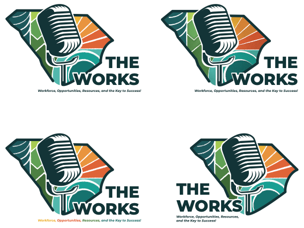
This phase reflects a more refined concept, exploring multiple typography treatments, layout adjustments, and subtle texture variations throughout the logo. Closer to the finalized direction, these designs focused on strengthening hierarchy, readability, and brand presence while testing how different type pairings and stylistic details enhanced the overall impact of The Works identity.